
The colours used to represent a brand can have a huge impact. Colour plays an especially important role as it’s one of the first things our brains process when we register an image. So, it’s no wonder companies put so much thought into choosing the right brand colour palettes that work best for them. In order to understand how an audience will see your brand, you might want to first consider the way your viewers will interpret different colours.
THE PSYCHOLOGY OF BRAND COLOURS
You make colour choices all the time, even if you don’t realize it. It usually happens by instinct, but there’s actually an entire science behind it known as Colour Theory. It’s important to understand your audience when leveraging colour meanings, because the psychological effects of colour aren’t inherently universal. People of different cultures, identities, and demographics will have unique interpretations of colour, which makes research and understanding of your target audience essential to your creative process.
WARMER COLOURS—such as reds, oranges, and yellows—stimulate the senses and elicit a sense of cheerfulness with their vibrancy. These colours pack tons of emotional meaning, but they can easily be overwhelming when used as the dominant hue in a composition.
COOL COLOURS – On the other side of the spectrum, cooler hues tend to elicit calmness and trustworthiness. Blues, greens, purples, and even pinks tend to be more versatile. They can be integrated into branding elements as a dominant or accent colour.
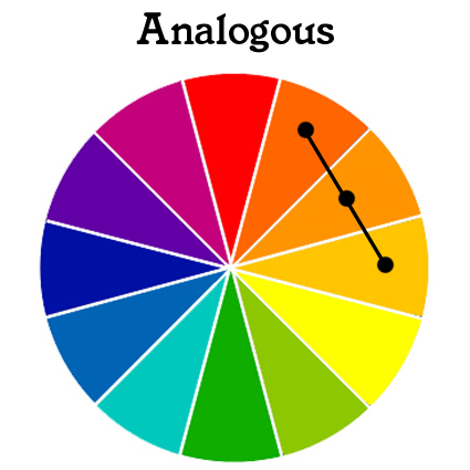


Read more – https://www.shutterstock.com/blog/how-to-pick-the-right-colors-for-your-brand?